Main RUM Dashboard
Understand how Core/Dash can help improve the Core Web Vitals and stay fast without regression

Trusted by market leaders
The Main RUM Dashboard Overview
Let's be clear: most performance tools give you sterile lab data. They show you how your site performs in a perfect world, on a fast connection, from a data center in Virginia. That's a nice theory, but it's not reality. Your business doesn't run in a lab.
The Main RUM Dashboard is your connection to that reality. This isn't a collection of vanity charts; it is the command center for understanding how your website actually performs for the thousands of real people who visit it every day. This is where gut feelings about performance are replaced by undeniable, data-driven facts.
If you are serious about performance, SEO, and conversion, this dashboard is your single source of truth.
What It Is and Why It Matters
The Main RUM Dashboard aggregates all the critical Real User Monitoring data collected by CoreDash into a single, high-level view. It’s designed for one purpose: to give you an immediate, at-a-glance understanding of your site's health so you can make fast, decisive calls.
Key components of the dashboard include:
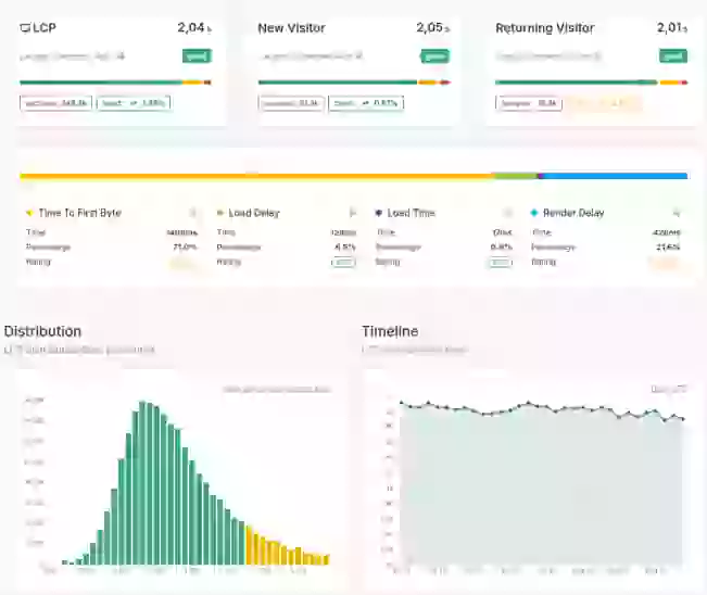
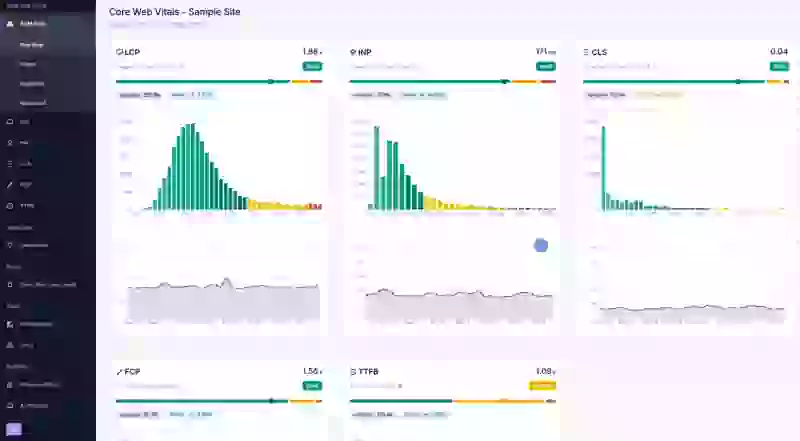
- Primary KPI Scorecards (LCP, INP, CLS): At the top, you'll see the big numbers for your Core Web Vitals. We show you the 75th percentile (p75) by default, and for good reason. Averages hide the pain. The p75 value tells you what experience three-quarters of your users are getting. If that number is red, you have a problem that is impacting the vast majority of your audience and, therefore, your bottom line.
- Main Time-Series Performance Chart: This is the heart of the dashboard. It plots your key metrics over your selected time window (e.g., the last 7 days). Its job is to reveal the story of your site's performance.
- Spot Regressions Instantly: Did that deployment last Tuesday tank your LCP? This graph will show it as a clear spike. There's no hiding from the data.
- Validate Improvements: Did your optimization efforts pay off? This is where you see the proof. A downward trend on this chart is a direct indicator of successful work.
- Key Segment Breakdowns (e.g., Device, Country): The dashboard provides high-level summaries of performance across your most critical user segments. If you see that your mobile LCP is significantly worse than your desktop LCP, that isn't just a data point. It's a direct signal that you are providing a subpar experience to a huge portion of your audience and likely leaving money on the table. These breakdowns are your first clue to where the biggest problems—and opportunities—lie.
How to Use The Dashboard Effectively
This dashboard isn't for passive viewing. It’s a tool for action.
- The Daily 30-Second Health Check: Make this your first stop every morning. A quick scan is all you need to know if your site is healthy or if there's a fire that needs your immediate attention. This simple habit separates proactive teams from reactive ones.
- Post-Deployment Validation: Don't rely on a developer's "it's fine on my machine." After every code change, theme update, or plugin installation, this dashboard is your objective judge. Watch the metrics in the hours and days following a deployment to see the real-world impact.
- The Starting Point for Investigation: The overview dashboard doesn't provide every answer, but it tells you exactly which questions to ask and where to start digging. If you see a performance spike in the main chart, your next click should be to use the Filtering & Dimensions to break that data down. Is the problem on a specific page? Is it a particular image? Is it only happening for users in a certain country?
The overview points you to the smoke; the detailed dimension filters lead you to the fire.
Making Data-Driven Decisions
The primary value of the Main RUM Dashboard is its ability to move your performance strategy from guesswork to certainty. While lab tests and anecdotal reports have their place, they don't capture the full picture of your users' diverse experiences.
This dashboard provides the unfiltered truth. By grounding your analysis in real user data, you can make faster, smarter decisions that directly improve user satisfaction and achieve your business goals.

