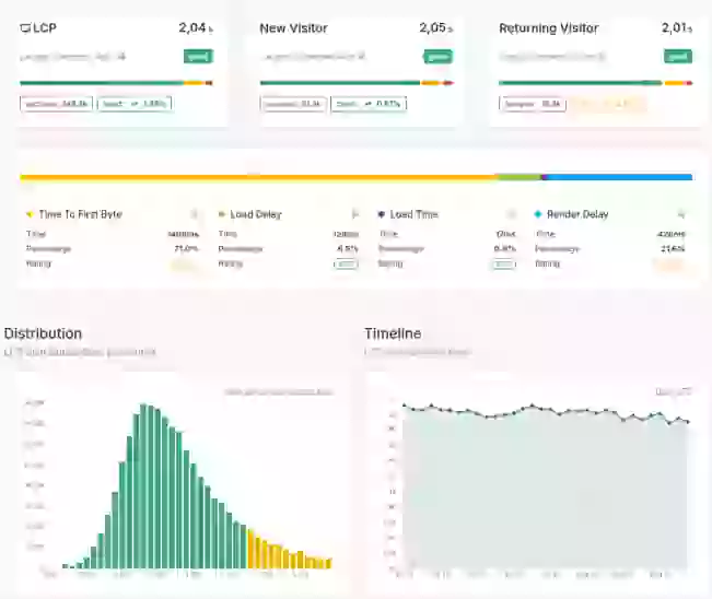
Visualizing Global Performance
Understand how Core/Dash can help improve the Core Web Vitals and stay fast without regression

Trusted by market leaders
Visualizing Global Performance with Geo Maps
The internet is global, but your server is not. It sits in a specific physical location. To assume a user in Sydney has the same experience as a user in Amsterdam is not just wrong, it's a fundamental failure to understand how the web works. Latency is real, and it is killing your performance for a huge portion of your audience.
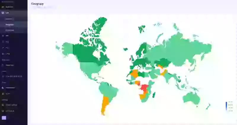
The Geo Map is not a vanity feature. It is a visual representation of this reality. It transforms abstract performance data into a strategic business intelligence tool, showing you precisely where in the world your user experience is breaking down due to distance.
The Purpose of a Geo Map
A Geo Map displays your key performance metrics—like LCP, INP, and TTFB—aggregated by country. The map is color-coded, typically from green (good) to red (poor), providing an immediate, intuitive understanding of your global performance footprint.
- Expose Geographic Bottlenecks: The map instantly reveals which countries are suffering from high latency. A bright red spot over a key market isn't just a data point; it's a direct signal that you are failing to serve that audience effectively.
- Translate Latency into Business Terms: This tool bridges the gap between technical metrics and business strategy. It helps you answer critical questions: "Are we losing customers in South America because our site is too slow there?" or "Is our poor performance in Asia preventing market entry?"
- Validate Infrastructure Investments: The map provides undeniable proof of the value of a Content Delivery Network (CDN) or edge computing. Before a CDN, you'll see red across the globe. After, you'll see green. It’s the clearest way to visualize your return on investment.
How to Use the Geo Map Effectively
This isn't a map for passive viewing; it's a tool for strategic action. Here is how professionals use it:
- Identify Growth Opportunities: Look for countries with significant traffic but poor (yellow or red) performance metrics. This is your lowest-hanging fruit. Investing in a CDN point of presence (PoP) to serve that region better isn't a cost; it's an investment in converting an audience you already have.
- Guide International Expansion: Are you planning to launch a marketing campaign in a new country? Check the Geo Map first. If that country is already red, you know that you must budget for performance infrastructure from day one, or the campaign will fail before it even begins.
- Diagnose Regional Issues: If you receive complaints from users in a specific country, the Geo Map is your first diagnostic step. It can instantly confirm if the issue is a widespread regional problem due to latency, or something more specific to that user's network.
Don't just look at the map. Ask what it's telling you about your business, your audience, and your missed opportunities.
The Bottom Line
Your users are not all located next door to your server, and your performance strategy cannot pretend they are. The Geo Map is the tool that forces you to confront this reality. Use it to make informed, data-driven decisions about your global infrastructure and turn geographic weaknesses into competitive strengths.

