Fix Layout Shift caused by auto sizing image
Images with auto width and auto height will cause a layout shift. Learn how to fix this

Fix Layout Shift caused by auto sizing image
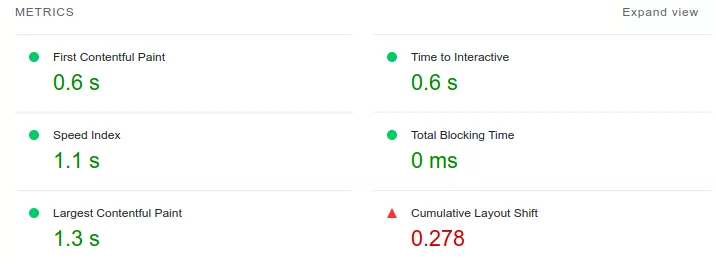
There is a common CSS pattern that will destroy your Cumulative Layout Shift score with a single line of code. I have seen it on dozens of sites, and it causes a layout shift even when you have explicitly set the width and height on your images. Even setting the aspect-ratio CSS property will not fix it.
This article focuses on the width: auto CSS problem. For the complete guide to all image and media layout shift causes (videos, iframes, art direction, responsive images, lazy loading, placeholders), see How Images and Media Cause Layout Shift.

Last reviewed by Arjen Karel on March 2026
The problem
Here is the CSS that causes the issue. It is commonly used for responsive images:
<style>
img {
    width: auto;
    height: auto;
    max-width: 100%;
}
</style>
The width: auto declaration is the problem. It overrides the width that the browser calculates from your HTML width and height attributes, which means the browser can no longer reserve space for the image before it loads. The image renders at 0x0 pixels until the file is downloaded and decoded, then snaps to its full size. That is your layout shift.
Why this happens
Since 2019, modern browsers map HTML width and height attributes to an internal aspect-ratio presentational hint. This hint has zero CSS specificity. Any author CSS rule beats it, even a simple img { width: auto; }. When CSS sets width: auto, the browser loses the information it needs to calculate the reserved height from the aspect ratio. Both dimensions become unknown until the image loads.
This is why setting aspect-ratio in CSS does not fix the problem either. With width: auto, the browser resolves the width to 0 for an unloaded image. An aspect ratio calculated from a width of 0 still produces a height of 0. The space reservation only works when the browser has at least one known dimension to work with.
It is also sneaky because it only causes a layout shift for first-time visitors. If you already have the image in your browser cache, the intrinsic dimensions are available immediately and no shift occurs. You, as the developer, will probably never see it.
How we found it
These issues are nearly impossible to catch in lab testing because Lighthouse runs on a fast machine with a warm cache. The way to detect them is with Real User Monitoring. RUM tracks the Core Web Vitals for real visitors on real devices and reports the actual CLS scores back to you, including shifts that only happen on first visits over slow connections.

The 2025 Web Almanac reports that 62% of mobile pages still have at least one unsized image. Many of those are caused by this exact CSS pattern: the developer set width and height in HTML, but a global CSS rule overrides them with auto.
The fix
Remove width: auto. Keep height: auto and max-width: 100%. This is the pattern recommended by web.dev for responsive images that do not cause layout shifts:
<style>
img {
    height: auto;
    max-width: 100%;
}
</style>
With this CSS, the browser uses the HTML width attribute to determine the image's width (capped at 100% of the container by max-width), and height: auto calculates the correct height from the aspect ratio. The space is reserved before the image loads. No layout shift.
Make sure your <img> tags include both width and height attributes:
<img src="hero.jpg" width="800" height="450" alt="Description"> Do yourself a favor: right-click any image on your site, choose "Inspect Element", and check the computed styles for width: auto. If you see it, you now know what to do.
Tip: For more image optimization techniques, see how to optimize images for Core Web Vitals and how to fix slow hero images.
Performance degrades the moment you stop watching.
I set up the monitoring, the budgets, and the processes. That is the difference between a fix and a solution.
Let's talk
