Optimize images for Core Web Vitals
"Learn how images affect the Core Web Vitals and how to optimize them

How images affect the Core Web Vitals
Images are responsible for the Largest Contentful Paint on 85% of desktop pages and 76% of mobile pages, according to the 2025 Web Almanac. That makes image optimization the single most impactful thing you can do for your Core Web Vitals. But images do not just affect loading speed. They can cause layout shifts, and on image-heavy pages, even slow down interactivity. This guide covers every angle: from HTML attributes and preloading to responsive images, modern formats, and the strategies you should apply to each image on your page.
Last reviewed by Arjen Karel on February 2026
Table of Contents!
- How images affect the Core Web Vitals
- Understanding Core Web Vitals
- Which Core Web Vitals can images affect?
- Step 1: Optimize the HTML image element for speed
- Step 2: Ensure the image is enqueued for download as early as possible
- Step 3: Ensure the image is downloaded as fast as possible
- Step 4: Eliminate layout shift!
- Step 5: Protect the main thread
- Step 6: Choose the right strategy for each image!
- Monitor the impact with Real User Monitoring
Understanding Core Web Vitals
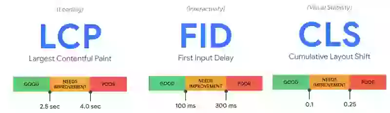
The Core Web Vitals are three user-centric metrics that Google uses as ranking signals: Largest Contentful Paint (LCP) measures loading speed, Interaction to Next Paint (INP) measures interactivity, and Cumulative Layout Shift (CLS) measures visual stability. Images can affect all three.
Which Core Web Vitals can images affect?
You might be surprised to learn that images can affect all of the Core Web Vitals. Images, if they are queued for download at a late time during rendering or if they are simply too large will usually result in a high LCP score. If image dimensions are not set or change during the loading phase images can also affect the CLS score. And finally, if image decoding takes up too much main thread work, they can even affect the INP. Let's take a closer look:
Largest Contentful Paint
Largest Contentful Paint (LCP) measures how long it takes for the largest element on the page (such as an image or video) to become visible to the user. According to the 2025 Web Almanac, images are the LCP element on 85% of desktop pages and 76% of mobile pages. If an image is enqueued too late or takes too long to load, it can significantly slow down the page's LCP score.
Cumulative Layout Shift
Cumulative Layout Shift (CLS) measures how much the content on a page shifts around as it loads. Images can cause layout shifts if they are not properly sized or if they are inserted into the page after it has already loaded, causing other elements to move around. The 2025 Web Almanac reports that 65% of desktop pages still have at least one image without explicit dimensions.
Interaction to Next Paint (INP)
Images can also impact Interaction to Next Paint (INP), which measures the time it takes for a page to visually respond after a user interacts with it. If there are too many large images that need to be decoded the page may take longer to respond to user interactions, leading to a poor INP score. This is most common on product listing pages where hundreds of images compete for resources.
Step 1: Optimize the HTML image element for speed
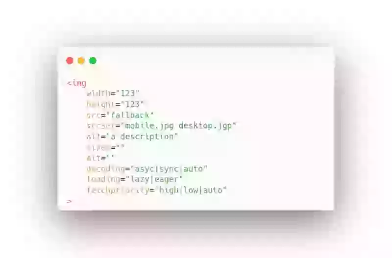
Src attribute
Specifies the URL of the image. This property is essential, as it tells the browser where to find the image.
Width and height attribute
Specifies the width and height of the image in pixels. These properties are important for rendering the image correctly on the page, as they define the size of the image container and how the image fits inside it. Always set both width and height to prevent layout shifts.
Alt attribute
Specifies alternative text for the image if it cannot be displayed. This is important for accessibility purposes, as it helps visually impaired users understand what the image is about. It's also important for search engine optimization (SEO), as search engines use the alt text to understand the content of the image.
Loading attribute (lazy loading)
Specifies how the browser should load the image (lazy, eager, or auto). This property is important for improving page performance, as it allows images to be loaded asynchronously and only when they are needed. Never set loading="lazy" on the LCP image. According to the 2025 Web Almanac, 16% of pages still lazy-load their LCP image, which is one of the most common performance mistakes on the web.
Srcset attribute
Sizes attribute
Decoding attribute
Fetchpriority attribute
The fetchpriority attribute specifies the priority of a resource's fetch relative to other resources on the page. The attribute can have one of three values: "high", "low", or "auto". A resource with a high priority is loaded before resources with lower priorities. As of 2026, fetchpriority is supported in all modern browsers (Chrome 102+, Safari 17.2+, Firefox 132+, Edge 102+) and is safe to use in production. Only 17% of pages use it on their LCP image, which means the vast majority of sites are missing an easy win.
Step 2: Ensure the image is enqueued for download as early as possible
The second thing to do, after you have optimized the HTML, is look at image scheduling. In many cases, the biggest bottleneck when it comes to images affecting the LCP metric is late scheduling. If a browser has a chance to download the LCP element early during the rendering process the image will be available to the browser as early as possible and the browser can start painting that element early in the rendering process.
Sound simple right? Well, how do we make sure the image is queued for download as early as possible.
Preload the LCP element
The most effective way to ensure an early download is to preload the image. Preloading the image is done with a simple tag at the start of the <head> element. For example:
<link rel="preload" as="image" href="image.jpg"> This simple tag will tell the browser that we will need "image.jpg" pretty soon and the browser will start downloading this file immediately.
Across sites monitored by CoreDash, 83% of page loads with a preloaded LCP image score 'good' on LCP, compared to 65% without preloading.
Eager load the LCP element
Use high fetchpriority
If, for some reason, you cannot preload the LCP element at least make sure the element has the fetchpriority attribute set to high. This will hint to the browser that an image is important to the page and the browser will download it with a high priority. Please note that using fetchpriority="high" is usually not as efficient as preloading an image!
Step 3: Ensure the image is downloaded as fast as possible
The third thing to do is to make sure you are not wasting precious network resources on images that are larger than they should be. You can do this using responsive images, using compression, and using new and faster image formats.
Responsive images
Here is a responsive image using srcset and sizes:
<img
  src="hero-800.jpg"
  srcset="hero-400.jpg 400w, hero-800.jpg 800w, hero-1200.jpg 1200w"
  sizes="(max-width: 600px) 100vw, 800px"
  width="800" height="450" alt="Descriptive alt text">
The browser picks the most appropriate image based on the viewport width. For lazy-loaded below-the-fold images, you can also use sizes="auto" (supported in Chrome 126+ and Edge 126+), which lets the browser calculate the correct size automatically based on the image's CSS layout.
Image Compression
New and faster image formats
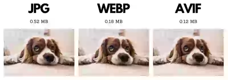
Images are often one of the largest resources on a webpage, and they can significantly slow down the loading speed of a page if they are not optimized. Modern image formats like WebP and AVIF offer significantly better compression than JPEG while maintaining the same visual quality.
WebP is supported by virtually all browsers (~99% global support) and typically reduces file size by 25-35% compared to JPEG. AVIF goes even further with 50%+ savings over JPEG and now has 94.7% browser support (Chrome 85+, Firefox 93+, Safari 16.4+). Despite this, the 2025 Web Almanac shows that AVIF is used for only 0.7% of LCP images, while JPEG still dominates at 57%. That is a massive opportunity.
Use the <picture> element to serve the best format each browser supports:
<picture>
  <source srcset="hero.avif" type="image/avif">
  <source srcset="hero.webp" type="image/webp">
  <img src="hero.jpg" width="800" height="450" alt="Descriptive alt text">
</picture>
The browser will try AVIF first, fall back to WebP, and use JPEG as a last resort. If you are curious about the future, read about JPEG XL and its current browser support status.
Step 4: Eliminate layout shift!
Images that change size while they are loading will cause a layout shift. It is as simple as that. This section covers the 3 most common reasons. For the complete guide to all image and media CLS causes (including videos, iframes, art direction, responsive image mismatches, and lazy loading), see How Images and Media Cause Layout Shift.
1. Missing image dimensions
2. Styling issues
Usually images are prevented from growing larger than the viewport by a simple CSS trick:
img{
   max-width:100%;
   height:auto;
}
This is a great trick and you should use it. Unfortunately I regularly see variants of this trick that do cause a layout shift. For example by adding width:auto:
img{
   max-width:100%;
   height:auto;
   width:auto;
}
This will make any image render with an auto width and height. This usually means the browser will render the image at 0x0px before the image has downloaded.
3. Placeholders
Some JavaScript-based lazy loading scripts use placeholders. If you use some sort of CSS trick like the above mentioned max-width:100% and height:auto then the auto height of the square placeholder will not match the height attribute of the image. Basically the image will first render with the square placeholder at 720x720 and when the final image has downloaded it will render at 720x180:
<img
  src="1x1placeholder.png"
  data-src="hero.png"
  width="720"
  height="180"
  style="height:auto;max-width:100%"
>
Step 5: Protect the main thread
The next thing to make sure is that not too many images get decoded on the main thread at the same time. Usually this is not going to be a problem but I have seen it happen many times on product listing pages (where sometimes as many as 500 images compete for resources!).
The trick is to add decoding="async" to all images to make sure these images can be decoded on a separate thread. Also try to avoid having this many images decoded all at once by adding loading="lazy" to all below-the-fold and hidden images.
Step 6: Choose the right strategy for each image!
Image strategies for the LCP element
The LCP element is usually the most important visual element. So we need to really prioritize this one.
- Preload the image early in the head of the page with this code:
<link rel="preload" as="image" href="path-to-img.png"> - Tell the browser that this image should not be lazy loaded by setting
loading="eager"or by omitting the loading attribute - Hint to the browser that this image should be downloaded with a high priority by using
fetchpriority="high"(if you are preloading the image, you can skip this part) - Set
decoding="sync"since this element is so important that we want to decode it on the main thread
Here is a complete example of an optimized, responsive LCP image with preloading:
<!-- In <head> -->
<link rel="preload" as="image" href="hero-800.jpg"
  imagesrcset="hero-400.jpg 400w, hero-800.jpg 800w, hero-1200.jpg 1200w"
  imagesizes="(max-width: 600px) 100vw, 800px">

<!-- In <body> -->
<img src="hero-800.jpg"
  srcset="hero-400.jpg 400w, hero-800.jpg 800w, hero-1200.jpg 1200w"
  sizes="(max-width: 600px) 100vw, 800px"
  width="800" height="450" alt="Descriptive alt text"
  fetchpriority="high" decoding="sync">
Image strategy for logos and other visible (non-LCP) images
Visible images should be loaded pretty soon during page load but preferably after the LCP element. We can achieve this by preloading the LCP element. That will give these visible images their natural, correct download order.
- Tell the browser that this image should not be lazy loaded by setting
loading="eager"or by omitting the loading attribute - Set
decoding="async"since this element can be safely decoded off the main thread!
Image strategy for below-the-fold images
All below-the-fold images should be lazy loaded. It is that simple! There are no exceptions!
- Tell the browser that this image should be lazy loaded by setting
loading="lazy" - Set
decoding="async"since this element can be safely decoded off the main thread!
Avoid background images
If you are using background images you need to reconsider. Background images cannot be lazy loaded and you cannot control the decoding property and you cannot set the fetchpriority. Background images are usually not responsive which will probably cost you a lot of bandwidth. But most importantly, background images are usually discovered after the browser has downloaded the CSS files. This is almost never the right time to trigger an image download! Read why background images are evil and how to defer background images when you have no choice.
You can use normal image tags in combination with the CSS object-fit:cover to make normal images behave as background images!
Monitor the impact with Real User Monitoring
After applying these optimizations, verify that they actually improve performance for real users. Lab tools like Lighthouse can confirm your changes are correct, but only Real User Monitoring shows you the actual impact on your visitors. Track your LCP, CLS, and INP over time to confirm that your image optimizations are working as expected.
CoreDash has MCP built in.
Connect it to Claude or any AI agent. Ask it why your INP spiked last Tuesday.
See how it works
