What is Cumulative Layout Shift (CLS) and how to fix it
The ultimate guide to finding, measuring, and fixing Cumulative Layout Shift for your site

Cumulative Layout Shift (CLS) in short
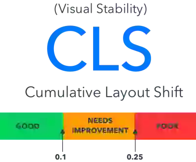
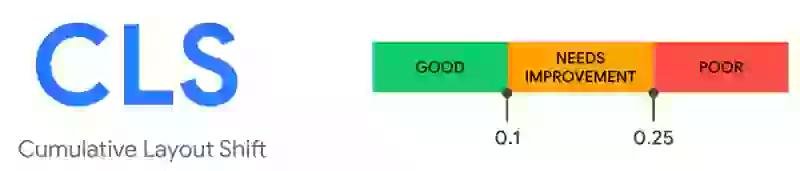
Cumulative Layout Shift (CLS) is a Core Web Vital that measures the visual stability of a web page. It quantifies how much visible content unexpectedly moves during the page lifecycle, using the formula: impact fraction multiplied by distance fraction. A good CLS score is below 0.1, while scores above 0.25 are considered poor. At least 75% of page visits must score "good" to pass.
Cumulative Layout Shift (CLS) is a user-centric metric that measures the visual stability of a web page. It tracks how often and how much the content on a page moves around as it loads. Layout shifts can be frustrating for users, as they can lead to accidental clicks, broken page formatting, and a generally confusing experience.
Since 2020 the Cumulative Layout Shift (CLS) is one of the three Core Web Vitals metrics. The CLS represents the visual stability part of the Core Web Vitals and determines how stable the main content of the webpage is during its entire life cycle.
In simple terms: a good CLS score will ensure a visibly stable experience!
What is Cumulative Layout Shift (CLS)?
Cumulative Layout Shift (CLS) represents the "visual stability" part of the Core Web Vitals. The Cumulative Layout Shift (CLS) measures the movements of the page as content renders or new content is shown on the page. It calculates a score based on how much of the page is unexpectedly moving about and how far it moves. These shifts of content are very annoying, making you lose your place in an article you've started reading or, worse still, making you click on the wrong button!
Table of Contents!
What is a good Cumulative Layout Shift (CLS) score?
A good CLS score is anything between 0 and 0.1. If your CLS score is between 0.1 and 0.25 it needs improvement. Any CLS score above 0.25 is considered poor. To pass the Core Web Vitals for the Cumulative Layout Shift, at least 75% of your visitors need to have a "good" CLS score.
Importance of CLS in web performance and user experience
Cumulative Layout Shift (CLS) is linked to both web performance and user experience because it directly impacts how stable and predictable a webpage feels while loading. Here is why it matters:
- UX, engagement and brand perception: Unexpected layout shifts disrupt user flow, making it harder to find information, click on buttons, and interact with the page as intended. This frustration can lead to poor experiences where users abandon the website altogether. A website's user experience reflects on the brand behind it. Frequent layout shifts can give the impression of a poorly designed or maintained website, disrupt user engagement, and lead to decreased interaction and potentially higher bounce rates.
- Accessibility: Layout shifts can be particularly disruptive for users with disabilities who rely on assistive technologies or screen readers. A stable layout ensures everyone can navigate and interact with the website effectively.
- SEO and Search Ranking: The Core Web Vitals are a small but significant ranking factor in Google. Google, along with other search engines, prioritizes websites that offer a good user experience. CLS is one of the Core Web Vitals metrics that Google considers when ranking websites. Optimizing for CLS can give your website a competitive edge in search results.
How is CLS measured?
The CLS of a page can be measured with the Layout Instability API. The following is a simple usage of this API:
new PerformanceObserver((entryList) => {
  for (const entry of entryList.getEntries()) {
    console.log('Layout shift:', entry);
  }
}).observe({type: 'layout-shift', buffered: true});
Calculating the CLS
The CLS is calculated using a simple, yet elegant formula:
CLS = sum(impact-fraction * distance-fraction)
The impact fraction measures how much of the visible content of the page has shifted. The distance fraction measures how far the content has shifted. If, for example, 50% of the page (how much) has shifted 25% (how far) of the viewport of the page, the CLS score = 0.50 * 0.25 = 0.125.
Expected vs. unexpected layout shifts
Not all layout shifts are bad, only the ones that you do not expect. When you click on a "load more items" link, for example, you would expect more items to appear on the page and the content of the page to shift.
That is why only unexpected layout shifts will cause a CLS contribution. For example, if a user clicks a button and in response new content will be added to the page (for example a menu dropdown), the layout shift will be excluded from the CLS. To be precise: layout shifts that occur within 500 milliseconds of user input will be excluded from calculations.
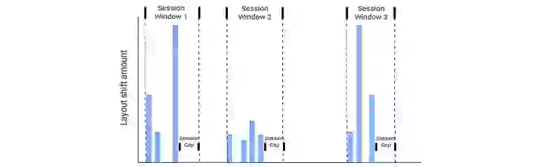
Layout shift sessions
When CLS was first introduced some sites were unfairly punished with a bad CLS score. For example, a page that implements infinite scrolling would have gotten the impact of the newly added content added to the total CLS score for each new scroll. That is why the CLS is now calculated in sessions. Each session has a maximum 5 second duration and a 1 second gap between layout shifts. The session with the largest CLS score will become the final CLS score.
If, for example, during the first session the CLS score is 0.095, then in the next session the CLS is 0.15, and for the last session the CLS score is 0, the final CLS score will be the highest of the three: 0.15.
CLS and the Core Web Vitals
Cumulative Layout Shift (CLS) is an important, user-centric metric for measuring visual stability. The Cumulative Layout Shift (CLS) is part of the Core Web Vitals along with the Largest Contentful Paint (LCP) and Interaction to Next Paint (INP). Together, these three metrics measure loading performance, interactivity, and visual stability.
Common CLS causes
The origin of all layout shifts is basically the same. At some point an element that was placed above another element took up more or less space than before. This is typically due to one or more of these causes:
Images, videos and iframes without dimensions
Unsized media is the number one cause of CLS on the web. According to the 2025 Web Almanac, 62% of mobile pages have at least one image without explicit dimensions. For the complete guide covering unsized images, videos, iframes, the width: auto CSS trap, art direction, responsive image mismatches, lazy loading, and placeholder images, see How Images and Media Cause Layout Shift.
Web font swaps
Web fonts are downloaded from the internet while the page renders with a fallback font. When the web font arrives, the size difference between fallback and final font causes a layout shift. Only 11% of pages preload web fonts, meaning the vast majority of the web is vulnerable to font-swap CLS.
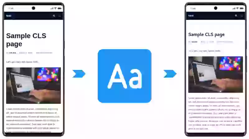
The fix involves two techniques: making the fallback font match the web font using @font-face metric overrides (size-adjust, ascent-override), and speeding up font delivery by self-hosting and preloading critical fonts. See the fix-and-identify guide for code examples.
CSS animations and transitions
CSS animations that use layout-triggering properties like top, left, width, and height cause the browser to recalculate the layout on every frame, producing CLS. According to the Web Almanac, 39% of mobile pages have non-composited animations contributing to CLS. The fix is to use transform and opacity instead, which run on the GPU compositor and never trigger layout. For the full walkthrough, see layout shift caused by CSS transitions.
Ads, embeds and dynamically injected content
Ads load late and push content down. Cookie consent banners appear and shift the page. AJAX requests inject new content without reserving space. These are all the same problem: something appears on the page that the browser did not know about at render time. The solution is always to reserve space with min-height and isolate the container with contain: layout style. For third-party embeds like YouTube and Google Maps, the facade pattern eliminates CLS entirely.
Scroll-triggered layout shifts
This is the CLS cause that Lighthouse will never catch. Headers that hide on scroll, parallax effects, and shrinking navigation bars often animate top or height, and scroll is not an excluding input in the Layout Instability specification. Every layout shift triggered by scrolling counts toward your CLS score. The fix: use transform: translateY() for any scroll-triggered animation. See how scroll-triggered animations cause CLS for the full walkthrough.
Finding and fixing CLS issues
Diagnosing CLS follows the same field-data-first methodology as the other Core Web Vitals. Start with Google Search Console or a RUM tool like CoreDash to confirm which pages are affected and which elements are shifting. Then use Chrome DevTools or the Core Web Vitals Visualizer extension to reproduce the issue locally and identify the root cause.
For the complete step-by-step diagnostic process, tool walkthroughs, code fixes for every cause, and a quick-fix checklist, see our dedicated guide: Find and Fix Cumulative Layout Shift (CLS) Issues.
Case study: Rakuten 24 and the business impact of CLS
Rakuten 24, a major Japanese e-commerce platform, conducted a detailed study on the impact of Cumulative Layout Shift on their business metrics. By reducing CLS across their product and category pages, Rakuten 24 achieved remarkable results:
- 53.37% increase in revenue per visitor for users who experienced low CLS compared to those with high CLS.
- 33.13% increase in conversion rate for the same improved CLS cohort.
- 15.20% decrease in bounce rate among visitors with stable page experiences.
These numbers demonstrate that CLS is not merely a technical metric. Visual instability directly costs businesses revenue by frustrating users during their browsing and purchase journey. When elements shift unexpectedly, users lose trust, misclick, and abandon their sessions. The Rakuten 24 study confirms that investing in CLS optimization has a measurable return on investment, particularly for e-commerce sites where every interaction counts.
What real-world CLS data shows
CoreDash data shows CLS is the best-performing Core Web Vital, with 92.8% of page loads on corewebvitals.io achieving a "good" score and virtually no device gap between mobile and desktop. Both desktop (92.8% good) and mobile (92.7% good) achieve near-perfect CLS scores, with a p75 of 0 on both device types.
This stands in contrast to metrics like LCP and INP, where mobile performance is significantly worse than desktop. CLS is uniquely better on mobile than desktop across the broader web, which is the reverse of every other Core Web Vital.
Globally, according to the 2025 Web Almanac, the picture is less optimistic:
- 72% of websites achieve good CLS scores overall, while 11% have poor CLS.
- 62% of mobile pages have at least one unsized image (down from 66% in 2024, but still a major CLS contributor).
- 39% of mobile pages have non-composited animations contributing to CLS.
- Only 11% of pages preload web fonts, meaning the vast majority of sites are vulnerable to font-swap layout shifts.
CLS has shown steady year-over-year improvement globally, but the data reveals that unsized images and non-composited animations remain the two most common causes. Addressing these two issues alone would eliminate layout shifts for a large portion of the web.
Related guides
This hub page covers Cumulative Layout Shift at a high level. For detailed, practical guidance on finding and fixing CLS issues, explore these dedicated guides:
- Find and Fix CLS Issues: The complete step-by-step diagnostic guide with tool walkthroughs, code fixes for every cause, and a quick-fix checklist.
- How Images and Media Cause Layout Shift: The definitive guide to CLS from unsized images, videos, iframes, art direction, responsive images, lazy loading, and placeholders.
- Fix layout shift caused by auto sizing images: A complete walkthrough for adding proper dimensions to images and responsive containers.
- Fix layout shift caused by CSS transitions: Identify and replace layout-triggering CSS animations with composited alternatives.
- Scroll-triggered animations and CLS: The CLS cause Lighthouse cannot catch, and how to fix it.
- Self-host Google Fonts: Reduce font-loading CLS by self-hosting fonts with proper font-display and preloading strategies.
- Ensure text remains visible during web font load: Configure font-display and font metric overrides to eliminate font-swap layout shifts.
- Build a chat widget with perfect Core Web Vitals: A case study on implementing third-party widgets without introducing CLS, INP, or LCP regressions.
For a complete overview of all Core Web Vitals metrics and optimization strategies, visit the Core Web Vitals overview or use the Ultimate Core Web Vitals Checklist to audit your site.
Real time data. Not 28 day averages.
CoreDash segments every metric by route, device, browser, and connection type.
Explore CoreDashYour CLS Questions Answered
Understanding CLS
What is a good CLS score?
A good CLS score is 0.1 or lower. Scores between 0.1 and 0.25 need improvement, and scores above 0.25 are considered poor. To pass the Core Web Vitals assessment, at least 75% of your page visits must have a CLS score of 0.1 or better. Unlike time-based metrics such as LCP or INP, CLS is a unitless score calculated from the impact fraction and distance fraction of layout shifts.
How is CLS calculated?
CLS is calculated using the formula: impact fraction multiplied by distance fraction. The impact fraction is the percentage of the viewport that was affected by the shift. The distance fraction is how far the elements moved, as a percentage of the viewport. For example, if 50% of the viewport shifted and the content moved 25% of the viewport height, the CLS score for that shift would be 0.50 * 0.25 = 0.125. The browser groups shifts into "session windows" (maximum 5 seconds, with a 1 second gap between shifts), and the largest session window becomes the final CLS score.
Causes and Fixes
What causes Cumulative Layout Shift?
The most common causes of CLS are images and iframes without explicit width and height attributes, web fonts that swap in with different dimensions, dynamically injected content (ads, cookie banners, promotional bars), CSS animations that use layout-triggering properties (top, left, width, height instead of transform), and late-loading third-party scripts. According to global data, 62% of mobile pages have unsized images and 40% have non-composited animations, making these the two leading CLS contributors.
Do user-initiated layout shifts count toward CLS?
No, layout shifts that occur within 500 milliseconds of a user interaction (click, tap, or keypress) are excluded from the CLS score. The browser marks these shifts with a "hadRecentInput" flag and does not include them in the calculation. However, if the response to a user interaction takes longer than 500 milliseconds, any layout shift that occurs after that 500ms window will count toward CLS. This is why it is important to ensure all interactive responses complete quickly.
CLS and SEO
Does CLS affect SEO rankings?
Yes, CLS is one of the three Core Web Vitals that Google uses as a ranking signal. While Google has stated that the Core Web Vitals are a relatively small ranking factor compared to content relevance, they can be a tiebreaker between pages with similar content quality. More importantly, poor CLS directly impacts user behavior: the Rakuten 24 case study showed a 53.37% difference in revenue per visitor between users who experienced low CLS versus high CLS. Improving CLS benefits both your search rankings and your conversion rates.

