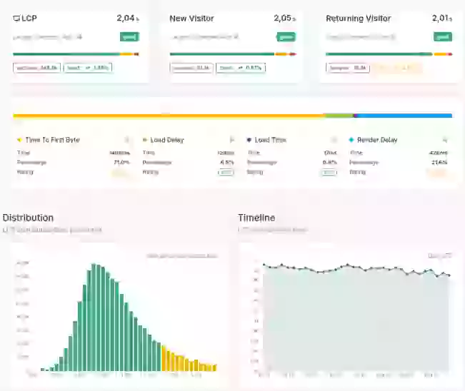
Understanding User Experience with Histograms
Understand how Core/Dash can help improve the Core Web Vitals and stay fast without regression

Trusted by market leaders
Understanding User Experience with Histograms
Let's get one thing straight: averages are for amateurs. An average performance score is the most misleading metric in web performance. It tells you nothing about the real user experience. It hides the pain. If one user loads your site in 1 second and another loads it in 9 seconds, the average is 5 seconds—a number that represents neither user's reality.
This is where amateurs stop. Professionals go deeper. We look at the distribution.
A histogram is your tool for seeing that distribution. It moves you from a single, useless average to a complete picture of every user's experience. The good, the bad, and the disastrously slow. It shows you the truth, not a convenient fiction.
What a Histogram Reveals
A histogram takes all your performance data points (e.g., thousands of individual LCP measurements) and groups them into buckets. It then shows you how many users fall into each bucket.
- The Buckets (X-Axis): These are ranges of performance scores, like 0-1s, 1-2.5s, 2.5-4s, and 4s+. They represent different levels of user experience, from excellent to poor.
- The Distribution (The Bars): The height of each bar tells you the percentage of your users who experienced performance within that specific bucket. This visual shape is the story of your site's performance consistency.
- The Percentiles (p75, p90, p99): These are the most critical takeaways. The 75th percentile (p75) isn't an average; it's the performance value that 75% of your users beat. If your p75 LCP is 3.8 seconds, it means three-quarters of your audience had a better experience, but a full 25% had an experience that was worse. That's a significant and often overlooked segment of your user base.
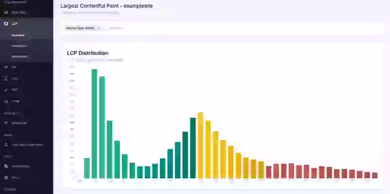
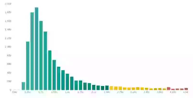
How to Diagnose Problems with a Histogram
A healthy histogram has a large concentration of users in the fast buckets on the left and a short, steep drop-off. Any other shape is a red flag that demands investigation.
- The Long Tail: This is the most common and critical pattern to spot. If your histogram has a long, low "tail" extending out to the right, it represents a significant number of users having a very poor experience. Averages hide this. A histogram makes it impossible to ignore. That long tail is where your frustrated users live. It's where conversions die.
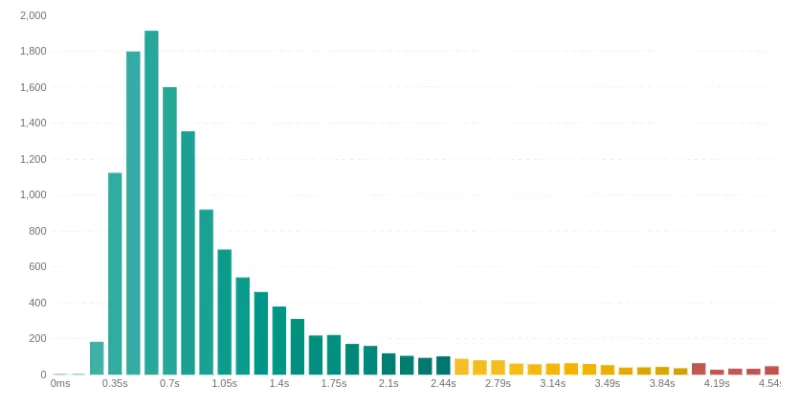
Your Action: Your primary goal should be to shorten this tail. This isn't about shaving a few milliseconds off your average; it's about eliminating those disastrously slow load times for a segment of your users. - The Double Peak (Bimodal Distribution): If you see two distinct peaks, it’s a massive clue. It means you don't have one website; you have two entirely different performance profiles. This is almost always a sign of a major segmentation issue.

Common Causes: A slow peak could be logged-in users hitting an un-cached backend, mobile users on slower networks, or users in a specific geographical region with high latency.Your Action: When you see two peaks, your next move is to use Filtering & Dimensions. Filter by device type, logged-in status, or country. Find the dimension that makes one of the peaks disappear. You've just found the root cause of the problem for an entire cohort of users.

The Bottom Line
Stop celebrating a "good" average score. It's a meaningless vanity metric. The only numbers that matter are the ones that represent real user experiences.
The histogram forces you to confront the reality of your slowest users—the ones who are most likely to abandon their cart, bounce from your site, and never return. Analyzing the distribution isn't just a best practice; it's the fundamental difference between amateur performance tuning and professional optimization that drives business results.

